
Léone Branding
The Challenge
Léone was born out of a deep heritage—an artisanal French patisserie and boulangerie founded on the cherished memory, recipes, and elegance of Maman Léone. Managed today by her five children, the brand needed to evolve from a beloved local establishment into a scalable, modern brand system.
The main strategic obstacle was finding the delicate balance between preserving emotional heritage and infusing contemporary retail dynamism. How do you scale a brand rooted in nostalgic warmth without losing its authentic, handcrafted soul?
The Solution
We built an integrated visual ecosystem that bridges the nostalgia of French culinary craft with the energy of modern life.
The Impact
By turning a family inheritance into a systematic design language, Léone now stands out as a premium, highly memorable patisserie brand. The design system honors traditional craftsmanship while offering the flexibility required for rapid modern expansion.
Project Expertise
Brand Strategy
Visual Identity
Custom Typeface Design
Packaging System

French elegance meets the rhythm of modern life.


We designed a modern brand mark that encapsulates both warmth and family connection. The central seal features a warm, characterful illustration representing Maman Léone’s nurturing spirit in the kitchen and the unbreakable bond of the five siblings guiding the brand into the future.


Rather than choosing an off-the-shelf script font, we wanted the brand’s personal story to be woven directly into its visual DNA. We dug into family archives, opened original handwritten recipe books, and meticulously traced Maman Léone's handwriting.
From individual strokes and marginal notes, we engineered Ms J. Leone Script—a custom digital typeface featuring over 300 characters, glyphs, and ligatures. Every piece of communication and packaging now carries the authentic signature of the mother behind the recipes.
FONT DESIGNER:
Oğuzhan Cengiz / Hurufat Fonts


We chose Fais Dodo as a brand asset to anchor the brand in authentic French heritage and evoke the warm, comforting nostalgia of childhood. As a classic lullaby passed down through generations, its lyrics—mentioning a mother baking cakes and a father crafting chocolate—create a natural, emotional bridge to artisanal treats made with care and love.
By weaving this iconic cultural touchstone into our identity with a warm, handwritten touch, we instantly communicate comfort, family tradition, and the genuine art of pastry-making to our audience.
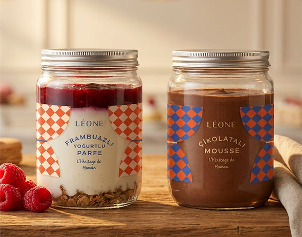


To elevate the shelf and table presence, we departed from muted traditional bakery palettes and introduced a striking combination of French Blue, Butter Yellow, and Dynamic Vermilion Red:
French Blue: Grounds the heritage, authenticity, and French artisanal roots. Butter Yellow: Evokes warmth, rich ingredients, and the comforting feeling of fresh-baked goods. Vermilion Red: Adds a modern, joyful accent that sparks appetite and pops on retail surfaces.
The packaging architecture spans everything from custom baguette sleeves and pastry boxes to tissue wraps and artisanal seals—ensuring a unified, joyful unboxing experience across every single touchpoint.


PEP is a team who connect consumer insight with market and trade environment to deliver competitive packaging designs for our products. They have an easy going attitude, listen well and always gives priority to customer needs.
Teoman Gürgan
Marketing and Corporate Communications Director


