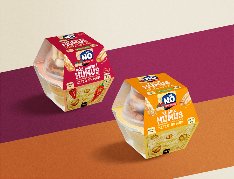
Mr. No packaging design
Problem:
Dardanel’s Mr. No sandwiches needed a packaging redesign to stand out in a highly competitive market. The existing packaging lacked the visual impact necessary to capture customers' attention on crowded shelves, making it difficult for consumers to quickly identify the product.
Solution:
PEP developed a bold and vibrant packaging design for Mr. No sandwiches, focusing on maximizing shelf visibility. By employing strong color coding and high-contrast elements, the design ensures immediate recognition. The new packaging enhances the brand's identity while making it easier for customers to spot their favorite sandwich from a distance.
This visually striking design solves the problem of shelf invisibility, positioning Mr. No sandwiches as not only a convenient and delicious choice but also impossible to miss.
Project Expertise
Packaging design
Photo-shoot


The agency created a packaging design for the "Classic" series centered around the triangle as the key visual element. By integrating this geometric shape prominently into the design, they reinforced the triangular structure of the sandwiches, creating a strong, memorable connection between the product’s form and its packaging.
This design not only enhances brand consistency but also makes the "Classic" series instantly recognizable, allowing customers to associate the iconic shape with quality and tradition.

PEP developed tailored packaging designs for the Vienna bread tuna sandwich and the ham croissant. For the Vienna bread tuna sandwich, the design emphasized sophistication with refined color palettes and subtle visual cues, echoing the premium nature of the Vienna bread.
For the ham croissant, the agency incorporated soft, pink tones and a hand made illustration that evoke the buttery richness of the product.


PEP designed hummus sandwich packaging, featuring vibrant depictions of key ingredients like chickpeas, olive oil, and herbs. This hand-drawn, artisanal style not only highlights the natural, wholesome qualities of the product but also sets it apart from the rest of the sandwich range.
By using this bespoke illustration, the packaging effectively conveys the freshness and authenticity of the hummus sandwich, creating a visual connection to its Mediterranean origins. The design balances originality with brand consistency, making the product both visually appealing and unmistakably part of the Mr. No family.
Illustration by: Damla Akdere


PEP developed a new packaging line for Artizan sandwiches, inspired by the charm of a playful French bakery — a fitting look for sandwiches made with specialty breads and premium ingredients.
Pep Brand Agency revitalized our Mr. NO brand by crafting a fresh and dynamic design language that resonates with our target audience. They approached each new product category with the same level of care and delivered solutions that met our needs exceptionally well.
Ayşe Açıkgöz
Mr. NO Brand Executive


