
SushiDa
The Challenge: Beyond the Category Noise
In a rapidly expanding category, the pressure for "quick action" often comes at the cost of identity. SushiDa faced the risk of becoming "brandless"—lost in the fast-paced retail shuffle. We had to stop, reconsider the entire brand family, and build a foundation that could withstand the speed of the market without losing its soul.
The Solution: A Refreshed Vision
SushiDa was reimagined with a refreshed logo and a bold, colorful visual language designed to elevate its presence across every touchpoint.
Built on a young, energetic, and innovative design approach, the new identity brings modern sushi culture to life through clarity and a strong brand character. The updated system creates a more dynamic look while strengthening shelf impact and visibility in a competitive retail environment.
The Result: A Confident Statement
From logo refinement to the overall visual system, every detail was carefully crafted to express freshness and accessibility. We turned the packaging into a confident and distinctive brand statement, ensuring SushiDa doesn’t just move fast—it stands out.
Project Expertise
Logo refresh
Packaging design


We distilled the brand’s essence into a cleaner, more contemporary logo. The refresh focuses on clarity and high-impact visibility, ensuring the symbol remains iconic and legible across everything from small-scale packaging to large-format retail displays.

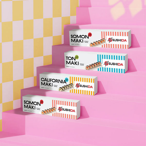
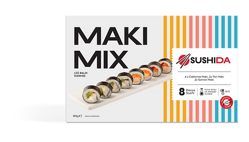
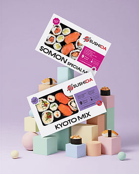
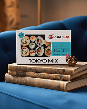
The packaging for the frozen range was engineered to challenge the perceptions of the category, replacing the clinical look of typical frozen goods with vibrant, appetite-driven aesthetics.
The Signature: Boom Roll
As the brand’s flagship fried sushi, the Boom Roll required a design that matched its name. We treated the packaging as a high-energy "hero" moment, using explosive visual cues and a dedicated color palette to signal its unique crunch and bold flavor profile. It’s more than just a product; it’s the brand’s boldest personality on the shelf.


Designed for the modern, fast-paced consumer, the Sushi Wrap packaging prioritizes functional elegance and "grab-and-go" clarity.
We developed a slim, ergonomic visual system that fits perfectly into an active lifestyle without compromising the brand’s premium feel
For the Onigiri range, the challenge was to translate a traditional staple into a trendy, accessible retail format.
We utilized a playful yet geometric design language that emphasizes the product’s iconic shape while ensuring the functional opening instructions remain intuitive and clear.


PEP is a team who connect consumer insight with market and trade environment to deliver competitive packaging designs for our products. They have an easy going attitude, listen well and always gives priority to customer needs.
Yüce Kaner Atalay
Dardanel Marketing and Corporate Communications Director


